Web Development
WCAG 2.2 provides a practical framework for making websites, applications, and digital content more accessible to people with disabilities. However, website accessibility is not limited to screen readers because it also supports keyboard users, people with low vision, users with limited mobility, and people who need clearer content.
Therefore, accessibility should begin during planning rather than after development. As a result, teams can prevent barriers before they spread across templates, components, and user journeys.
What Is WCAG 2.2?
WCAG stands for Web Content Accessibility Guidelines. The World Wide Web Consortium develops the standard through its Web Accessibility Initiative.
In practice, WCAG 2.2 defines testable outcomes for websites, web applications, documents, media, and other digital experiences. Instead of forcing one visual design or framework, it explains what users must be able to perceive, operate, understand, and access reliably.
For example, a keyboard requirement can be met with standard HTML, a JavaScript framework, server-rendered pages, or a single-page application. However, the final interaction must remain usable without a mouse.
Why Website Accessibility Matters
Website accessibility allows more people to complete essential tasks independently. Moreover, accessible interfaces often provide clearer structure, stronger mobile usability, better forms, and fewer interaction problems.
For instance, users should be able to:
- Read articles and service information
- Navigate menus and page sections
- Complete registration, contact, and payment forms
- Access accounts and authentication flows
- Use search, filters, dialogs, and dashboards
- Watch videos with captions
- Download accessible documents
- Use the website on mobile devices
Consequently, accessibility improves product quality as well as inclusion. In addition, it reduces the risk that important journeys work for some users but fail for others.
Who Benefits from Accessible Web Design?
Accessible web design supports people with permanent, temporary, and situational limitations. For example, it can help users with:
- Blindness or low vision
- Colour-vision differences
- Deafness or reduced hearing
- Limited mobility or dexterity
- Cognitive or learning disabilities
- Speech disabilities
- Photosensitivity
- Temporary injuries
- Age-related changes
- Glare, noise, or one-handed use
Therefore, accessibility covers far more than alternative text. It also affects navigation, focus, forms, colour, media, authentication, animation, responsive behaviour, and custom controls.
WCAG 2.0 vs WCAG 2.1 vs WCAG 2.2
| Version | Main Contribution | Current Use |
|---|---|---|
| WCAG 2.0 | Established the core principles, guidelines, and success criteria | Still referenced by some older policies |
| WCAG 2.1 | Added requirements for mobile use, low vision, and cognitive needs | Included within WCAG 2.2 |
| WCAG 2.2 | Added criteria for focus, dragging, target size, help, repeated entry, and authentication | Preferred starting point for current work |
Most requirements from WCAG 2.0 and WCAG 2.1 remain part of WCAG 2.2. However, WCAG 2.2 removes Success Criterion 4.1.1, Parsing, from the newer standard.
Nevertheless, a project may still need to assess that criterion when a contract, policy, or legal requirement refers to an older version. Therefore, teams should confirm the exact target before making a formal WCAG compliance claim.
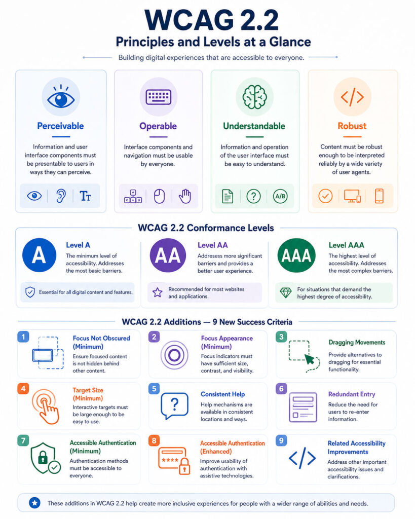
The Four WCAG Principles
WCAG is organised around four principles known as POUR:
- Perceivable
- Operable
- Understandable
- Robust
Because the principles address different barriers, a website should satisfy all four. For example, strong colour contrast does not compensate for a keyboard trap.
1. Perceivable
Users must be able to perceive the information and interface components presented by the website. Therefore, perceivable content includes:
- Alternative text for meaningful images
- Captions for prerecorded videos
- Transcripts for audio
- Sufficient text and non-text contrast
- Layouts that remain usable when enlarged
- Information that does not depend only on colour
- Responsive content that reflows on narrow screens
For example, a red border alone should not identify an invalid field. Instead, the page should provide visible text and a programmatically associated error message.
2. Operable
Users must be able to operate the interface through supported input methods. Consequently, operable experiences include:
- Complete keyboard access
- Visible keyboard focus
- A logical focus order
- Enough time to complete tasks
- Alternatives to dragging
- Suitable target size and spacing
- Navigation through headings and skip links
- Protection from harmful flashing content
For instance, a menu that opens only on mouse hover can block keyboard and touch users. Therefore, it should also work through focus, keyboard commands, and touch input.
3. Understandable
Users must be able to understand both the content and the behaviour of the interface. As a result, understandable websites provide:
- Clear and direct language
- Consistent navigation
- Descriptive labels
- Predictable interactions
- Useful form instructions
- Specific error messages
- Consistent help mechanisms
- Reduced repeated data entry
Therefore, an error such as “Something went wrong” should be replaced with guidance that identifies the problem and explains how to correct it.
4. Robust
Content must work reliably with browsers, assistive technologies, and other user agents. For that reason, robust implementation relies on:
- Semantic HTML
- Correct roles and element names
- Programmatically available states and values
- Accurate accessible names
- Standards-based custom components
- Meaningful status messages
For example, a styled <div> does not automatically behave like a button. By contrast, a native <button> already provides keyboard activation, focus, and the correct role.
WCAG Guidelines and Success Criteria
The four principles contain 13 broad guidelines, while those guidelines contain testable success criteria. In addition, supporting documents explain techniques, exceptions, testing conditions, and known failures.
Principles
↓
Guidelines
↓
Success Criteria
↓
Techniques and Testing GuidanceTherefore, teams should read the exact success criterion together with its Understanding document. Otherwise, a short checklist may miss important details.
WCAG Compliance Levels
| Level | Meaning | General Use |
|---|---|---|
| A | Addresses essential accessibility barriers | Minimum foundation |
| AA | Includes all Level A and Level AA criteria | Common target for websites and applications |
| AAA | Includes all Level A, AA, and AAA criteria | Highest defined level with additional requirements |
To claim Level AA conformance, a page must satisfy every applicable Level A and Level AA criterion. Therefore, passing most criteria does not create partial Level AA conformance for that page.
However, teams can still report progress honestly while unresolved barriers remain. In that case, they should avoid an inaccurate WCAG compliance claim.
Does Level AAA Guarantee Complete Accessibility?
No. Even the highest conformance level cannot address every need in every situation.
Therefore, organisations should combine WCAG compliance work with inclusive design, usability testing, user feedback, and additional cognitive-accessibility guidance.
What Changed in WCAG 2.2?
| Success Criterion | Level | Main Requirement |
|---|---|---|
| 2.4.11 Focus Not Obscured (Minimum) | AA | Focused content must not be completely hidden |
| 2.4.12 Focus Not Obscured (Enhanced) | AAA | The focused component must remain fully visible |
| 2.4.13 Focus Appearance | AAA | Focus indicators must meet enhanced size and contrast requirements |
| 2.5.7 Dragging Movements | AA | Provide a non-dragging method when dragging is not essential |
| 2.5.8 Target Size (Minimum) | AA | Provide suitable target size or spacing, with defined exceptions |
| 3.2.6 Consistent Help | A | Repeated help mechanisms should remain in a consistent relative order |
| 3.3.7 Redundant Entry | A | Avoid requesting the same information again in one process |
| 3.3.8 Accessible Authentication (Minimum) | AA | Provide an authentication path that does not rely only on a cognitive test |
| 3.3.9 Accessible Authentication (Enhanced) | AAA | Apply stronger limits to cognitive tests during authentication |
Focus Not Obscured
Keyboard users need to see which control currently has focus. However, sticky headers, cookie banners, chat widgets, fixed footers, and dialogs can cover the active element.
Therefore, developers should test focus while navigating menus, forms, notices, and floating controls. At Level AA, author-created content must not completely hide the focused component.
Dragging Movements
Some users cannot perform precise dragging movements. Therefore, when a feature relies on dragging, the interface should provide another method unless dragging is essential.
For example, sortable lists can include Move Up and Move Down buttons, while file uploaders can provide a standard file picker.
Target Size Minimum
Small controls placed close together can be difficult to activate. Consequently, WCAG 2.2 Level AA introduces a target-size or spacing requirement based on a 24 by 24 CSS-pixel measurement, subject to defined exceptions.
However, the technical minimum should not become the design goal. Larger targets and clearer spacing usually provide a better experience.
Consistent Help
When help mechanisms repeat across pages, users should find them in a consistent relative order. For example, help may include contact details, live chat, a contact form, frequently asked questions, or self-service guidance.
Consequently, moving support unpredictably between the header, footer, sidebar, and page body can create unnecessary difficulty.
Redundant Entry
A multi-step process should not force users to enter the same information repeatedly when the application already collected it. Instead, previously entered information should be populated, selectable, carried forward, or editable.
However, repetition may still be allowed when it is essential, required for security, or based on information that is no longer valid.
Accessible Authentication
Authentication creates barriers when it requires users to remember, transcribe, or solve information without an accessible alternative. Therefore, accessible authentication can include password-manager support, paste support, passkeys, sign-in links, autocomplete, and accessible alternatives to puzzles.
Most importantly, developers should not disable paste in password or one-time-code fields.
Who Is Responsible for Website Accessibility?
| Role | Primary Responsibility |
|---|---|
| Product Owner | Define accessibility requirements and priorities |
| Designer | Create readable, predictable, responsive, and keyboard-aware interfaces |
| Developer | Use semantic code and implement accessible behaviour |
| Content Author | Provide meaningful headings, links, alternatives, and clear language |
| Quality Analyst | Perform automated, keyboard, responsive, and assistive-technology testing |
| Project Manager | Include accessibility in scope, scheduling, acceptance criteria, and releases |
| Organisation | Maintain training, governance, monitoring, and remediation processes |
If accessibility belongs only to the final tester, defects appear too late and cost more to correct. Therefore, every role should include accessibility within its normal workflow.
Accessible Web Design: Practical Implementation
Accessible web design begins with native web technologies and adds custom behaviour only when necessary. Therefore, teams should first make the structure, controls, forms, media, and responsive layouts work with standard browser behaviour.
Use Semantic HTML
Semantic HTML communicates purpose and structure to browsers and assistive technologies. For example, prefer native elements such as <button>, <a>, <nav>, <main>, <form>, and <table>.
<button type="button">
Open filters
</button>By contrast, a clickable <div> does not automatically provide keyboard activation, focus, or the correct role. As a result, native elements usually require less custom accessibility code.
Create a Logical Heading Structure
Headings organise content and help screen-reader users move between sections. Therefore, choose heading levels according to the document structure rather than their default visual size.
<h1>Laptop Buying Guide</h1>
<h2>Choose a Processor</h2>
<h3>Office Work</h3>
<h3>Gaming</h3>
<h2>Choose Memory</h2>Instead of selecting a heading only because it looks smaller, use CSS to control its appearance.
Use Landmarks and a Skip Link
Landmarks help users jump between major page areas. In addition, a skip link lets keyboard users bypass repeated header content.
<a class="skip-link" href="#main-content">
Skip to main content
</a>
...
However, the skip link must become clearly visible when it receives focus. Similarly, multiple navigation regions should have distinct accessible labels.
Support Complete Keyboard Navigation
Users should be able to operate interactive functionality without a mouse. For example, menus, dialogs, tabs, accordions, carousels, forms, date pickers, uploads, and charts should support suitable keyboard commands.
First, use Tab and Shift + Tab to review the focus sequence. Next, test Enter, Space, arrow keys, and Escape where those keys are expected.
Avoid Keyboard Traps
A keyboard trap occurs when focus enters a component but cannot leave through standard interaction. Therefore, a dialog should provide a working close control, support appropriate keyboard commands, and return focus to the control that opened it.
Moreover, modal focus should stay within the active dialog only while that behaviour is appropriate.
Keep Focus Visible
Never remove the browser focus outline without providing a strong replacement. For example:
button:focus-visible,
a:focus-visible,
input:focus-visible,
select:focus-visible,
textarea:focus-visible {
outline: 3px solid currentColor;
outline-offset: 3px;
}In addition, test the indicator against both the control and its background. Finally, confirm that sticky headers, cookie notices, and floating widgets do not cover the focused component.
Maintain a Logical Focus Order
Keyboard focus should follow the visual and reading order. Therefore, avoid positive tabindex values because they create a separate sequence that becomes difficult to maintain.
Instead, arrange the DOM in the intended order and use tabindex="0" only when a custom element genuinely needs to enter the natural tab sequence.
Use Links and Buttons Correctly
A link moves the user to another page, resource, or location. By contrast, a button performs an action within the current interface.
| Action | Correct Element |
|---|---|
| Open another page | Link |
| Download a document | Link |
| Submit a form | Button |
| Open a dialog | Button |
| Expand an accordion | Button |
| Apply a filter | Button |
Consequently, choosing the correct element gives users more predictable behaviour.
Write Descriptive Link Text
Link text should explain its destination or purpose. Therefore, replace vague phrases such as “Click here” or “Read more” with meaningful text.
For example, use “Download the accessibility report” or “Read the laptop buying guide.” When repeated short labels are visually required, add enough accessible context to distinguish each destination.
Add Useful Alternative Text
Meaningful images need text alternatives that communicate their purpose in context. However, the same image may need different text in different situations.

By contrast, decorative images should generally use alt="". Otherwise, some screen readers may announce an unhelpful file name.
Do Not Put Essential Text Only Inside Images
Text inside an image does not resize or reflow as effectively as real HTML text. Therefore, use normal text for headings, instructions, prices, button labels, comparisons, and form guidance.
When an infographic contains important information, provide an equivalent explanation nearby.
Make Icon Buttons Accessible
An icon-only button needs an accessible name. For example:
In addition, do not depend on the icon shape alone when users may not recognise its meaning.
Build Accessible Forms
Every form control needs a clear and programmatically associated label. For example:
Because placeholder text disappears after input, it should not replace a visible label. Moreover, related radio buttons and checkboxes should use and .
Identify Required Fields and Errors Clearly
Do not rely only on a red asterisk. Instead, include visible wording such as “Email address (required)” and use the native required attribute where appropriate.
When validation fails, explain what happened and how to correct it. For example:
Enter a valid email address.
After submission, an error summary can help users find all problems. In addition, focus should move to a useful location rather than disappearing.
Do Not Use Colour Alone
Colour can reinforce meaning, but it should not be the only indicator. For example, an error state can combine colour, text, an icon, a border style, and a programmatic state.
Similarly, charts should use labels, patterns, shapes, or direct values instead of depending only on coloured lines.
Provide Sufficient Contrast
At Level AA, normal text generally requires a contrast ratio of at least 4.5:1, while large text generally requires at least 3:1. Therefore, check body text, links, placeholders, text over images, hover states, focus states, and errors.
In addition, meaningful control boundaries and graphics need suitable non-text contrast. As a result, input borders, focus outlines, checkbox indicators, selected tabs, and chart elements also require review.
Support Text Enlargement and Reflow
Users should be able to enlarge text without losing content or functionality. Therefore, avoid fixed-height text containers, clipped labels, overlapping text, and inflexible buttons.
At narrow widths or high zoom, ordinary content should reflow without forcing two-directional scrolling. However, genuinely two-dimensional content such as maps or complex data tables may still need horizontal scrolling.
Allow Custom Text Spacing
Users may increase line height, paragraph spacing, letter spacing, and word spacing. Consequently, the page should remain readable without clipping, overlap, hidden content, or broken controls.
Make Touch Targets Easy to Activate
Small controls create barriers on phones, tablets, touch laptops, and alternative pointing devices. Therefore, provide enough size and spacing for menu buttons, pagination, close icons, checkboxes, radio buttons, carousels, and form controls.
Although WCAG 2.2 defines a technical minimum with exceptions, larger targets are usually easier to use.
Provide Alternatives to Dragging
Dragging should not be the only method for completing an action. For example, a sortable list can include Move Up and Move Down buttons.
Similarly, a range control can support keyboard input and editable values. For file uploads, provide both drag-and-drop and a standard file picker.
Add Captions, Transcripts, and Audio Description
Prerecorded videos with meaningful speech require captions at the applicable conformance level. Therefore, captions should include dialogue, important sounds, speaker identification, and relevant music cues.
In addition, audio-only content should provide an equivalent transcript. When important visual information is missing from the audio, an audio description or another equivalent explanation may also be required.
Provide Media Controls and Reduce Motion
Users should be able to pause, stop, or control automatically moving content when required. In particular, avoid automatically playing audio because it can interfere with screen readers and concentration.
Moreover, websites should respect reduced-motion preferences:
@media (prefers-reduced-motion: reduce) {
*,
*::before,
*::after {
scroll-behavior: auto;
animation-duration: 0.01ms;
animation-iteration-count: 1;
transition-duration: 0.01ms;
}
}However, do not remove essential progress or status information while reducing motion.
Make Data Tables Accessible
Use tables for structured data rather than visual page layout. For example:
Monthly subscription plans
Plan
Users
Price
For complex tables, additional row headers, header associations, or a simplified alternative may be necessary.
Use ARIA Carefully
ARIA can communicate roles, states, properties, and relationships when native HTML is insufficient. However, ARIA does not automatically provide keyboard interaction or visual behaviour.
Therefore, prefer native HTML whenever possible. If a custom component is necessary, implement its complete keyboard model, focus behaviour, states, and accessible name.
Announce Important Dynamic Updates
Single-page applications can update content without loading a new page. Consequently, screen-reader users may miss the change unless the application communicates it.
Item added to cart.
Use status messages for meaningful events such as saved forms, completed uploads, or updated result counts. However, avoid announcing every minor visual change because excessive messages can overwhelm users.
Manage Focus in Single-Page Applications
When a client-side route changes, users need a clear indication that new content has loaded. Depending on the workflow, focus may move to the page heading, main content, validation summary, or a newly opened dialog.
However, ordinary background updates should not move focus unexpectedly.
Make Authentication Accessible
Login and verification flows should work with password managers, browser autofill, and copy-and-paste. Therefore, use meaningful autocomplete values such as username, current-password, and one-time-code.
In addition, provide an accessible alternative when a process would otherwise require memorising, transcribing, or solving information.
Keep Help Consistent and Avoid Repeated Entry
When related pages offer contact, chat, or self-help options, present them in a consistent relative order. Similarly, carry previously entered information through a multi-step process.
However, repeated entry may still be appropriate when information has changed or a valid security reason requires confirmation.
Make Downloadable Documents Accessible
A website can be accessible while its linked files remain unusable. Therefore, review PDFs, spreadsheets, presentations, and word-processing files for titles, headings, reading order, alternatives, table structure, labels, contrast, and keyboard access.
Where practical, provide important information as accessible HTML as well as a downloadable file.
Accessibility Testing for WCAG 2.2
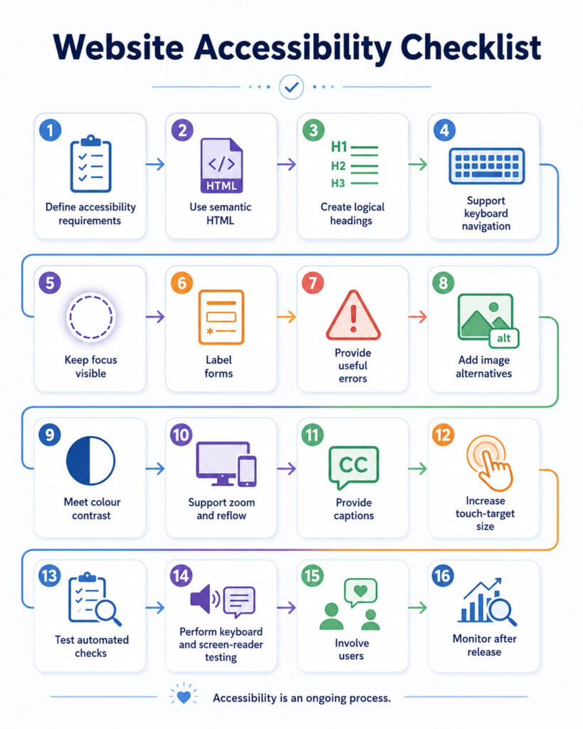
Accessibility testing should combine automated tools, manual checks, assistive technologies, and user feedback. Therefore, no single method should be expected to identify every barrier.
Use Automated Accessibility Testing
Automated tools can quickly detect missing labels, empty buttons, some contrast failures, invalid ARIA, duplicate IDs, and missing page language. However, they cannot reliably judge whether alternative text is meaningful, focus order is logical, or instructions are clear.
Therefore, automated results should guide manual accessibility testing rather than replace it.
Perform a Keyboard-Only Test
First, avoid using the mouse. Next, confirm that every interactive control is reachable, focus remains visible, menus open correctly, forms can be submitted, and no component creates a keyboard trap.
Finally, repeat the test at narrow widths and high zoom because responsive layouts may introduce different behaviour.
Test Focus Visibility
Inspect every focused control against its background and surrounding component. In particular, review links in coloured sections, buttons over images, dialog controls, cookie notices, fixed headers, and chat widgets.
In addition, scroll while moving focus to confirm that no fixed element completely hides the active control.
Test with a Screen Reader
A basic screen-reader review should cover the page title, language, landmarks, headings, links, buttons, images, forms, errors, tables, dialogs, and status messages. However, do not test only by reading every line from the beginning.
Instead, navigate by headings, landmarks, controls, and form fields to determine whether the page supports efficient use.
Test Browser Zoom and Reflow
Increase browser zoom and inspect the complete page. For example, confirm that text remains visible, controls remain operable, dialogs fit the viewport, navigation stays available, and fixed elements do not cover content.
As a result, high-zoom testing can reveal barriers that ordinary device testing misses.
Test Custom Text Spacing
Apply increased line, paragraph, letter, and word spacing. Afterwards, verify that text is not clipped, buttons can expand, navigation does not overlap, and labels remain associated with controls.
Test Colour and Contrast
Check contrast in default, hover, focus, selected, disabled-looking, and error states. For example, review normal text, links, input boundaries, focus indicators, icons, charts, and text over images.
In addition, inspect the page in grayscale or through a colour-vision simulation to identify information communicated only through colour.
Test Forms Thoroughly
Submit each form with empty, invalid, incomplete, and unusually long values. Moreover, test browser autofill, password managers, keyboard interaction, high zoom, and screen readers.
After submission, verify that focus moves to a useful location and that every error is available visually and programmatically.
Test Mobile, Touch, and Voice Interaction
Mobile testing should cover target size, spacing, orientation, text scaling, touch keyboards, sticky navigation, drag alternatives, modal height, and reflow. However, a responsive layout is not automatically an accessible layout.
Similarly, voice-control testing should confirm that visible labels match accessible names and that clickable areas use real interactive elements.
Include People with Disabilities
Technical conformance testing and user testing answer different questions. WCAG testing determines whether defined requirements are met, while user testing reveals whether the experience is understandable and practical.
Therefore, involve people with disabilities during research, design, testing, and review where possible.
Create an Accessibility Test Scope
Large websites may contain thousands of pages, templates, and states. Consequently, a representative scope should include primary templates, navigation, search, forms, authentication, checkout, dashboards, media, tables, downloads, error pages, custom components, and responsive states.
In addition, test complete user journeys rather than isolated pages.
Use a Structured Evaluation Method
A structured evaluation method helps teams define scope, explore the website, select a representative sample, evaluate that sample, and report findings. However, a formal audit should not replace accessibility work during design and development.
Prioritise Accessibility Issues
Not every defect has the same impact. Therefore, prioritise issues that block complete journeys, prevent keyboard use, hide critical information, break authentication, prevent form submission, or affect shared components.
For example, fixing one reusable navigation or form component may remove barriers across hundreds of pages.
Accessibility Severity Example
| Priority | Example | Recommended Response |
|---|---|---|
| Critical | A keyboard user cannot complete payment | Block release or provide an immediate alternative |
| High | Form errors are not announced | Resolve before the next release |
| Medium | Heading levels are inconsistent | Correct within planned remediation |
| Low | An advisory enhancement exceeds the current target | Add it to the improvement backlog |
In addition, business severity should consider how often the component appears and which user journeys it affects.
Build Accessibility into the Design System
A design system can prevent repeated defects by providing approved patterns. Therefore, document colour combinations, typography, focus styles, button sizes, forms, errors, dialogs, navigation, loading states, tables, notifications, and responsive behaviour.
Moreover, each component should include keyboard interaction, accessible names, states, code guidance, and test coverage.
Add Accessibility to the Definition of Done
A feature should not be considered complete merely because it matches the visual design. Instead, the definition of done should include semantic HTML, keyboard operation, visible focus, responsive reflow, contrast review, accurate names, form validation, automated checks, and manual testing.
Test During Development
Developers can reduce defects by testing components before they reach complete pages. For each component, inspect the HTML, use it with a keyboard, check its name and role, enlarge text, review narrow layouts, run automated checks, and try important states with a screen reader.
As a result, problems can be corrected before they spread across templates.
Add Automated Checks to Continuous Integration
Automated checks can identify regressions during development and deployment. For example, they may detect a removed label, invalid ARIA value, missing title, empty button, new contrast failure, or duplicate identifier.
However, passing automated checks does not prove WCAG compliance. Therefore, manual accessibility testing remains necessary.
Review Third-Party Components
Websites often depend on chat widgets, cookie notices, payment forms, calendars, maps, video players, captcha services, and booking tools. These components can introduce keyboard traps, missing labels, weak contrast, inaccessible frames, or focus problems.
Therefore, include accessibility requirements during vendor selection, implementation, and renewal.
Make WordPress Websites More Accessible
WordPress provides useful semantic features, but the final result depends on the theme, plugins, page builder, content, and custom code. Therefore, review theme navigation, heading structure, skip links, forms, sliders, popups, cookie notices, tabs, accordions, tables, focus visibility, and contrast.
However, installing an accessibility plugin does not automatically correct inaccessible content, templates, or styling.
Accessibility Checklist for Content Authors
- Use one clear page title
- Organise content with meaningful headings
- Write descriptive link text
- Add useful alternative text
- Mark decorative images correctly
- Avoid instructions based only on colour or position
- Use simple and direct language
- Provide captions and transcripts
- Use real lists and data tables
- Review downloadable documents
Accessibility Checklist for Designers
- Use sufficient contrast
- Design strong focus indicators
- Provide generous touch targets
- Do not rely on colour alone
- Support zoom and text resizing
- Keep help and navigation consistent
- Design clear form errors
- Provide alternatives to dragging
- Avoid unnecessary motion
- Document component states
Accessibility Checklist for Developers
- Use semantic HTML
- Support complete keyboard interaction
- Maintain a logical focus order
- Manage focus in dialogs and route changes
- Expose correct names, roles, states, and values
- Associate labels and errors with controls
- Use live regions only when needed
- Support reflow and custom text spacing
- Respect reduced-motion preferences
- Test custom components with assistive technology
Common Website Accessibility Mistakes
- Removing focus outlines
- Using clickable
<div>elements - Using placeholders instead of labels
- Adding the same alternative text to every image
- Choosing heading levels for appearance
- Using low-contrast text
- Communicating errors only through colour
- Opening inaccessible popups
- Disabling browser zoom
- Using drag-and-drop without an alternative
- Blocking password-manager paste
- Assuming automated tools find every issue
- Adding ARIA without keyboard behaviour
- Testing only with a mouse
Website Accessibility Myths
| Myth | Reality |
|---|---|
| Accessibility is only for blind users | It supports visual, hearing, physical, cognitive, speech, and situational needs |
| Alternative text makes a website accessible | Accessibility also covers navigation, forms, media, focus, contrast, and interaction |
| Automated tools prove conformance | They identify only part of the possible issues |
| ARIA fixes inaccessible HTML | Incorrect ARIA can create additional barriers |
| Accessible web design prevents attractive design | Accessible interfaces can remain modern and visually engaging |
| Responsive design is automatically accessible | Mobile layouts can still contain focus, contrast, target-size, and screen-reader barriers |
| Accessibility is a one-time project | Content, code, plugins, and components require ongoing monitoring |
| Level AA guarantees a perfect experience | WCAG should be combined with inclusive design and user testing |
WCAG 2.2 Implementation Plan
- Define the target conformance level
- Identify the websites, applications, and documents in scope
- Train product, design, development, content, and testing teams
- Audit primary templates and user journeys
- Fix shared components first
- Add accessible web design requirements to the design system
- Remediate content and downloadable documents
- Add automated checks to development workflows
- Perform manual keyboard and assistive-technology testing
- Involve users with disabilities
- Document remaining barriers and remediation plans
- Monitor accessibility after every release
Website Accessibility Decision Guide
| Problem | Recommended Starting Point |
|---|---|
| Users cannot navigate without a mouse | Review semantic controls, keyboard behaviour, and focus order |
| Focused controls disappear behind sticky content | Review Focus Not Obscured and fixed positioning |
| Buttons are difficult to tap | Increase target size and spacing |
| Users must drag items | Add buttons or another single-pointer alternative |
| Form errors are unclear | Add associated labels, instructions, and specific errors |
| Login blocks password managers | Allow paste, autocomplete, and an accessible authentication path |
| Content breaks at high zoom | Fix reflow, fixed dimensions, and overlapping elements |
| Automated scans pass but users struggle | Perform manual keyboard, screen-reader, and usability testing |
| Many pages repeat the same defects | Fix shared templates and design-system components |
| A formal audit is required | Use a structured evaluation method and qualified reviewers |
Does Accessibility Help SEO?
Accessibility and search optimisation are different disciplines, although they share some useful practices. For example, both can benefit from descriptive titles, logical headings, semantic HTML, meaningful links, readable content, text alternatives, responsive design, and clear navigation.
However, a website can perform well in search while remaining inaccessible. Therefore, website accessibility should be evaluated against user needs and WCAG requirements rather than treated only as an SEO technique.
Final Verdict
WCAG 2.2 provides a practical framework for improving content, navigation, forms, keyboard interaction, responsive layouts, media, and authentication.
First, use semantic HTML and native controls. Next, add visible focus, strong contrast, meaningful labels, accessible media, responsive reflow, and carefully tested custom components.
However, automated checks alone are not enough. Therefore, accessibility testing must also include keyboard use, screen readers, zoom, mobile interaction, and feedback from people with disabilities.
Conclusion
Website accessibility is an ongoing product-quality responsibility.
First, understand the four WCAG principles. Next, use WCAG 2.2 success criteria to define testable requirements.
Then, build accessible web design into the design system, code review, content workflow, accessibility testing, and release criteria. In addition, monitor themes, plugins, third-party widgets, and new content after launch.
Most importantly, design for real people rather than only for a passing score. Although WCAG compliance provides a strong foundation, thoughtful testing and continuous improvement create the better experience.
AboutTPJ Technical Team
The Project Jugaad Technical Team creates practical, easy-to-follow content on software development, web technologies, artificial intelligence, cybersecurity, cloud platforms, and digital tools. Our articles are informed by more than 13 years of hands-on experience with .NET, Angular, SQL Server, AWS, WordPress, Linux hosting, application deployment, and real-world troubleshooting. Each guide is researched, reviewed, and updated to provide accurate, useful, and actionable information for developers, businesses, and everyday technology users.